What Is Seasonal Color Analysis?
This site contains affiliate links, you can view the full disclosure here for more information.
Do you ever feel like certain colors don’t work for you, leaving you tired or washed out? Or maybe you have a closet full of clothes but still struggle to find something that makes you feel amazing? If so, then it's time to consider color analysis. But what is seasonal color analysis?

Seasonal color analysis has taken the internet by storm, trending on social media and sparking lively discussions on Reddit. Why? Because it can be a valuable color guide for determining which hues best complement your natural features.
But with so much information out there, it's easy to get overwhelmed and perhaps a tad lost. I'm here to try and demystify the process and help you confidently use the information to enhance your style.
This post is all about seasonal color analysis.
Color Analysis Explained
If you've read my Classic Wardrobe series, you know I'm a big believer in building your wardrobe around timeless, versatile neutral pieces. Those, in my personal opinion, are the foundation of a closet that mixes and matches effortlessly.
I've found that seasonal color analysis adds another helpful layer for expanding your wardrobe. Rather than changing the principles of a classic wardrobe, it helps you choose the specific shades that are most flattering on you. For example, instead of simply buying a sweater, seasonal color analysis can help you determine whether a warm camel, a cool taupe, or a soft ivory will best complement your natural coloring.
Think of it this way: a classic wardrobe gives you the structure, while seasonal color analysis helps you personalize it. Together, these layers create a wardrobe that is both timeless and uniquely yours.
Let’s start with some basics. Color analysis involves studying and classifying a person's natural color characteristics, such as skin tone, hair color, and eye color. This is the foundation for identifying the colors that best complement you. This practice enhances wardrobe choices, makeup selections, and even home décor in many cases.
Tonal Analysis
In fashion and color theory, tonal analysis is the method of evaluating and categorizing colors by their undertones, temperature (warm or cool), value (light or dark), and intensity (bright or dull). The primary objective of tonal analysis is to determine the most flattering color palette for an individual.
In practice, this involves:
- Identifying Undertones: Analyzing whether a color has a warm (yellow, orange, red) or cool (blue, green, purple) base.
- Assessing Temperature: Determining the overall warmth or coolness of a color.
- Evaluating Value: Measuring how light or dark a color appears.
- Examining Intensity: Judging the brightness or softness of a color.
Tonal analysis is often used by stylists and designers to create cohesive and visually appealing outfits that complement a person's skin tone, hair color, and eye color.

What is Seasonal Color Theory?
Color theory is a fundamental concept in fashion, encompassing the principles and guidelines that dictate how colors interact, harmonize, and appeal to the human eye. This theory is essential for fashion designers, stylists, and anyone looking to elevate their understanding of color to enhance their personal style.
Key Components of Color Theory:
The Famous Color Wheel: a visual representation of all the colors arranged according to their chromatic relationships. Primary colors (red, blue, yellow), secondary colors (green, orange, purple), and tertiary colors (combinations of primary and secondary colors) are arranged on the wheel to illustrate their relationships.
Color Harmony: Refers to aesthetically pleasing color combinations based on certain rules. Common harmonies include complementary, which are opposite colors on the wheel, analogous, the neighboring colors on the wheel, and triadic, the three colors evenly spaced around the wheel. These harmonies guide the creation of visually appealing, balanced color palettes.
Color Context: Explores how colors behave in relation to other colors and shapes. The perception of a color can change depending on the colors surrounding it. For instance, a purple dress might look different when paired with yellow accessories compared to blue ones. Understanding color context helps in making informed decisions in styling and design.
Color Temperature: Divides colors into warm (reds, oranges, yellows) and cool (blues, greens, purples) categories. Warm colors are frequently associated with energy and vibrancy, while cool colors are linked to calmness and tranquility. This division helps create moods and atmospheres through color choices.
Although not universally agreed upon, some colors are perceived as warmer than others. This is known as a color's temperature or undertone. Colors can be warm, cool, or some combination of the two (neutral).
Warm Colors are typically associated with yellow, orange, and red. Cool colors are typically associated with purple, blue, and green. This does not mean that every yellow is warm and every blue is cool. Any color on the wheel can have warm or cool undertones. For example:
Acidic Yellow (yellow mixed with green) has a cooler quality.
Tangerine Yellow (a mix of yellow and orange) has a warmer quality.
Color Value, Intensity & Chroma: Color value refers to how light or dark a color is, while intensity pertains to the brightness or dullness. Designers manipulate these aspects to create depth, contrast, and emphasis within an outfit, influencing the overall visual impact. This is also complemented by Chroma, which describes a color's saturation.
Understanding Seasonal Color Analysis
Now that we have a grasp of the basics of color theory, it's time to explore seasonal color analysis. This method helps identify the hues that will best enhance your natural features. These hues, often called "wow colors," highlight your beauty without dulling or overpowering it. Each of the four seasons, Spring, Summer, Autumn, and Winter, is divided into three categories: bright/soft, light/dark, and true.
Seasonal color analysis isn't a new concept. Our modern understanding of harmonious colors stems from 19th-century Impressionist painters' observations of nature. To accurately depict each season, they studied the colors characteristic of each one.
The Four Color Seasons
Nature's colors change as the seasons progress. Think of the landscapes through Spring, Summer, Autumn, and Winter. For visuals, think of the fresh tints of spring, the gentle yet bright tones of summer, the rich/earthy shades of Autumn, and the icy hues of Winter.
In a seasonal framework, your seasonal type depends on the tone of your skin, hair, and eyes (either warm/golden or cool/ashy) and the lightness or darkness of your overall coloring, including your hair. The four seasons represent the possible variations of these variables:
Spring

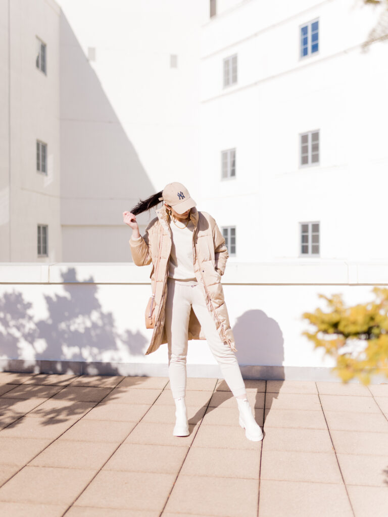
If you're a Spring, think fresh, warm, and full of life. Your best colors tend to reflect the feeling of the season itself: sunshine, blooming flowers, and new greenery. Rather than deep or muted shades, Spring palettes are known for light, warm, and clear colors.
Colors: Reach for warm, fresh shades like peach, coral, mint green, soft yellow, ivory, camel, and warm turquoise. These colors help brighten your complexion without overpowering your natural features.
Patterns: Soft florals, watercolor prints, playful stripes, and other light, cheerful patterns are great choices. Look for prints with warm, clear colors rather than cool or muted tones.
Examples:
- A peach sundress with a mint cardigan.
- A coral blouse paired with light-wash jeans.
- An ivory sweater with camel trousers.
- A warm turquoise top with white denim.

Fresh, vibrant, and effortlessly elegant, a coral top is such a lovely example of the Spring palette in action. It pairs with classic wardrobe staples like white denim, camel blazers, or light-wash jeans, making it easy to incorporate into an everyday wardrobe.
Summer

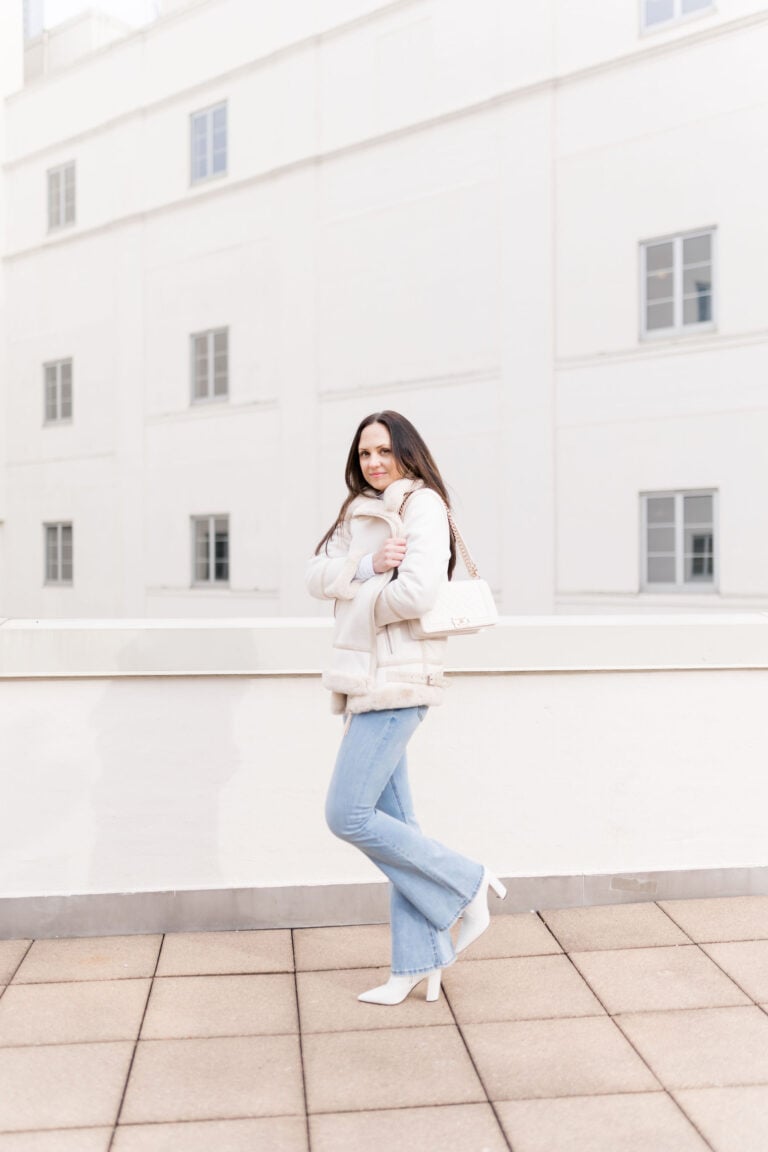
If you're a Summer, think soft, cool, and understated. Your best colors tend to reflect the season's gentle feeling: hazy skies, ocean mist, and blooming lavender fields. Rather than bright or highly saturated shades, Summer palettes are known for cool, muted, and elegant colors.
Colors: Reach for soft, cool shades like dusty rose, lavender, powder blue, sage green, soft navy, cool gray, mauve, and soft white. These colors can help create a balanced, harmonious look without overwhelming your natural features.
Patterns: Watercolor florals, subtle stripes, delicate plaids, and other soft, low-contrast prints are great choices. Look for patterns with cool, muted colors rather than bold, high-contrast combinations.
Examples:
- A dusty rose blouse paired with light gray trousers.
- A powder blue sweater with white jeans.
- A lavender midi dress with a light gray cardigan.
- A sage green blouse tucked into soft navy trousers.
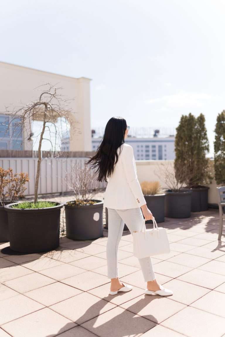
Fun fact! I am a Summer 🙂
Soft, elegant, and timeless, a cornflower blue silk dress is THE example of the Summer palette. The cool, muted blue feels refined without being overpowering, making it an effortless choice for weddings, date nights, or any occasion where you want to feel polished.
Autumn

If you're an Autumn, think rich, warm, and earthy. Your best colors tend to reflect the feeling of the season itself: changing leaves, golden sunsets, and forest landscapes. Rather than cool or bright shades, Autumn palettes are known for warm, deep, and muted colors.
Colors: Reach for rich, earthy shades like olive green, rust, mustard, terracotta, chocolate brown, camel, warm teal, and burnt orange. These colors can help bring warmth to your complexion while complementing your natural coloring.
Patterns: Earthy florals, plaid, herringbone, animal prints, and other patterns featuring warm, muted colors are great choices. Look for prints with rich, earthy tones rather than cool or highly saturated colors.
Examples:
- An olive green utility jacket paired with dark-wash jeans.
- A rust-colored sweater with camel trousers.
- A terracotta midi dress with brown leather boots.
- A mustard blouse tucked into chocolate brown pants.
An olive green leather jacket is a great example of the Autumn palette in action. The rich, earthy color adds warmth to your wardrobe while still feeling like a neutral, making it easy to pair with everything from cream knitwear and dark-wash denim to camel trousers and brown leather accessories.
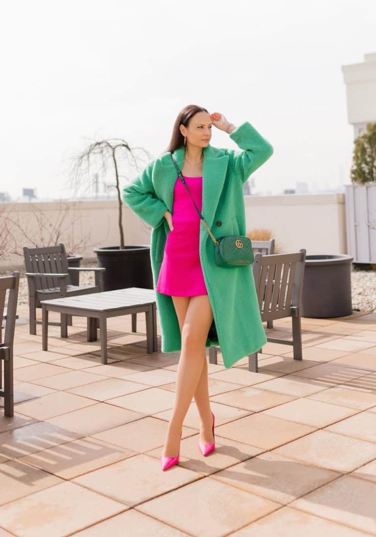
Winter

If you're a Winter, think bold, cool, and striking. Your best colors tend to reflect the crisp feeling of the season itself: freshly fallen snow, icy landscapes, and clear winter skies. Rather than warm or muted shades, Winter palettes are known for cool, high-contrast, and saturated colors.
Colors: Reach for cool, bold shades like true black, crisp white, emerald green, sapphire blue, ruby red, fuchsia, cobalt blue, and icy pink. These colors can help enhance your natural contrast and make your features stand out.
Patterns: Bold stripes, geometric prints, color blocking, and other high-contrast patterns are great choices. Look for prints with crisp, cool colors rather than soft, blended tones.
Examples:
- A crisp white button-down with black trousers.
- An emerald green sweater paired with dark-wash jeans.
- A cobalt blue blazer over a black dress.
- A fuchsia blouse with tailored white pants.
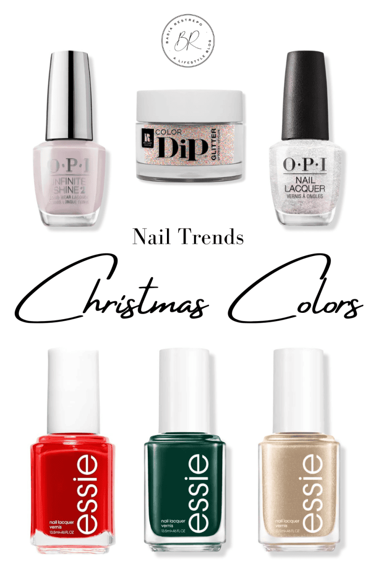
A true red sweater is a classic example of the Winter palette in action. Cool, saturated colors like this create beautiful contrast and pair well with wardrobe staples like black trousers, crisp white denim, charcoal wool coats, and dark-wash jeans. It's a timeless piece that adds color while still feeling polished and easy to wear. Perfect for the holidays too!
What is my Color Palette?
Professional color analysis can be a fun experience and a great way to get an outside perspective, but it isn't your only option. While in-person consultations can be very informative, they can also be expensive, so there are plenty of ways to start discovering your best colors from the comfort of your own home if you're not ready to go in-person. The goal isn't to get everything perfect on the first try; it's simply to start noticing which colors help you look and feel your best.
1. Start with your Skin Tone
Your undertone is one of the biggest clues in seasonal color analysis. While no single test is foolproof, these can give you a good starting point.
- Look at your veins. If they appear bluer or purpler, you may have cool undertones. If they look greener, you may lean towards warm.
- Try the jewelry test. Notice whether you naturally gravitate toward silver or gold jewelry. Many people find silver complements cool undertones, while gold flatters warm undertones.
Remember, none of these tests should be used on their own. Think of them as pieces of a puzzle rather than a final answer.
2. Analyze your Natural Hair, Skin, and Eye Color
Your natural hair color, eye color, and skin tone all work together to create your overall vibe. For example:
- Springs often have warm, clear features.
- Summers tend to have cooler, more muted coloring.
- Autumns usually have rich, warm, earthy coloring.
- Winters often have cool coloring with higher contrast between their features.
These are general patterns, not strict rules. People in the same season can look VERY different from one another, which is why it's important to consider your overall coloring rather than focusing on a single feature. For example, I was convinced that I was a Winter because I'm cool toned with dark hair but it turned out that I'm a Summer.
3. Try the Mirror Test
One of the easiest ways to start identifying your best colors is simply to see how different shades look on you. Stand in front of a mirror in natural daylight and hold different colored tops, scarves, or pieces of fabric near your face. As you compare colors, ask yourself:
- Does this color make my skin look brighter or duller?
- Do my eyes stand out?
- Does my complexion look healthy and even?
- Am I noticing the color first, or does my face naturally stand out?
The right colors tend to make you look more refreshed, while the wrong ones can make shadows, redness, or unevenness more noticeable.
Color Season Chart
This seasonal color chart provides a quick overview of the four color seasons and the shades typically associated with each one. Use it as a helpful reference as you begin exploring your palette, but remember that these are guidelines—not rules. The best colors are the ones that complement your natural features and make you feel confident.

Final Thoughts
Seasonal color analysis isn't about throwing out your wardrobe or following another set of fashion rules. As you can clearly see in the images, I don't live in my palette exclusively. Instead, think of it as another tool to help you make more intentional choices when building your wardrobe.
If you've been following my Classic Wardrobe series, you know I'm a big believer in starting with timeless, versatile pieces. Seasonal color analysis simply helps you choose the shades of those pieces that work best with your natural coloring.
Most importantly, don't feel like you have to get everything right the first time. Experiment with different colors, pay attention to the shades that make you feel confident, and remember that personal style is just that—personal. The goal isn't to fit perfectly into a color season. It's to build a wardrobe that makes getting dressed easier and helps you feel like the best version of yourself.
You Might Also Enjoy


 for exclusive updates, seasonal capsules, and refined living inspiration, delivered with elegance, always.